In Quest for a Name and Logo for the App in Reggio Emilia
The first prototype of the Italian App was almost ready for publication on the ‘Play’ and ‘App’ stores but the name for the App and the logo were still missing. So, we decided to ask the Consulting Committee (C.C.), starting at the meeting we had in February even if it was held – for the first time – online, due to the outbreak of the pandemic.
Since the start of February, we collected the first ideas from various stakeholders and afterwards a list of proposed names was shared with all members of the C.C. and with parents from the local schools through an online poll provided by the Local Health Authority of Reggio Emilia. Each participant could choose three options (vote for three preferred names) and we have received more than 80 votes from parents and C.C. members.
The name that received the highest amounts of votes would be chosen. During the month of June we were able to identify the name: ‘BeBa – Benessere Bambini’ (in English: ‘Child wellbeing’).
Before the publication of the prototype on the store, we were still missing a logo and an icon. Therefore, we needed to quickly create an image, and that was a challenge. In the end, we took the decision to use a ‘provisional logo’ with the aim of directly asking the C.C. their opinion and gauging their willingness to contribute to the creation of a professional logo for the App. That turned out to be the right thing to do.
Indeed, during the online C.C. meeting we organised in the middle of July, we obtained interest from Reggio Children – a public-owned corporation created in 1994 by the Municipality of Reggio Emilia – that promotes the so-called ‘Reggio Emilia Approach’ in the field of child education – to help the CoSIE pilot develop a logo for the App.
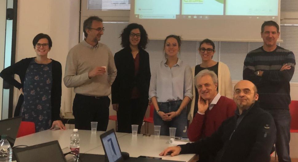
The graphic unit of Reggio Children has been working hard on this task and at the beginning of September, they presented to the CoSIE partners’ Italian Steering Committee their results consisting of a series of ten logos. After a long discussion, three logos (each in two versions using different colours) were selected.

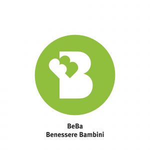
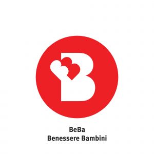
 OPTION A
 OPTION B
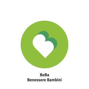
 OPTION C
During the design of the logo, Reggio Children has chosen to safeguard simplicity and recognition above all. They have started using the letter B with the aim of reinforcing the identity of the app by using brand recall. In the first two options, the large B and small B allude to two different subjects, an adult and a child, close and protected by the adult in the first case, embraced by the adult but more autonomous in the second case. In the third option, the two B’s become like a heart, thus recalling the concepts of love and care. With respect to colours, two alternatives have been proposed: red, which enhances the emotional characteristics, and green, a reassuring colour, reminiscent of the colour-guide of the app.
We were again in a position to co-decide the choice of logo with the stakeholders. For that purpose, we issued a further online poll for voting, using a Likert scale (1 to 5). The logos that received the highest score appeared to be Option “A”.
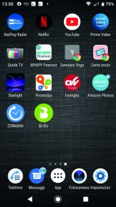
Reggio Children carried out a simulation in order to give us a clear idea on how the logo looks on a standard smartphone screen (see figure n. 2 below). We will submit this simulation to the next Consulting Committee for final approval.
Needless to say that what we have briefly illustrated entails a long and time-consuming process, but we are confident that it represents a clear example of co-creation in practice! A model (way of doing) that can be replicated in other institutional settings and national contexts.
Written by Andrea Bassi, Teresa Gallelli, Paolo Giorgi Rossi and Laura Bonvicini